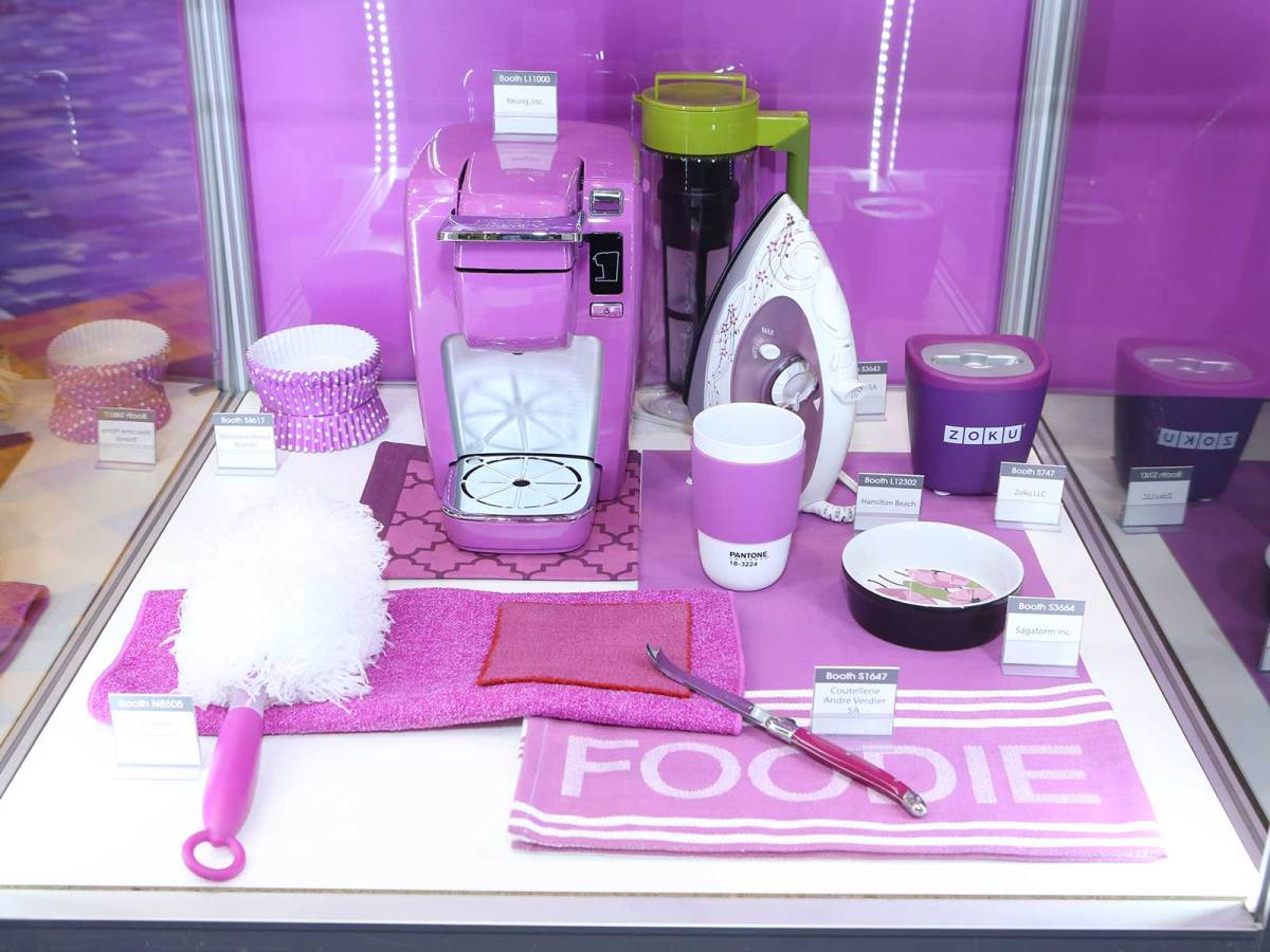
Late last year, this website exclusively revealed the new colour combinations Pantone predicts will dominate houseware trends over the coming 18-to-24 months. Known as ‘palettes’, these nine colour gamuts range from the vibrancy of bright tones, like the Kenwood kMix range, to earthier sylvan notes, as seen in Miele’s Generation 6000 range.
(Looking at the colour palettes as shades on a webpage doesn’t really convey the depth of emotion or communicative ability of colours to transfer personality from the owner and user to an inanimate object; a process called anthropomorphism. To rectify that, I have uploaded a gallery of products co-ordinated in the chosen palettes; a way of observing these trends in their natural environment.)
Click here to sign up for our free daily newsletter
From youngsters moving out and buying their first set of appliances and homewares to mature age users looking to maintain a welcoming home, colour is a trend that crosses age and geographical barriers, according to Pantone’s leading colour and design forecaster, Lee Eiseman.
“From my perspective, colour is about emotion, and each person has their own attachment,” Eiseman said in an email from the 2014 International Home + Housewares Show in Chicago.
“Colour delivers emotions to consumers. Baby Boomers are appreciating it even more with the proliferation of eye surgeries; many can see far more clearly than before. The Y Generation as new parents is inclined to be savvy with trends and…retailers or manufacturers needs to stay on top of those trends and be more educated than they are.”
The past 6 months have seen some eye-catching product releases that use both colour and form factor to stand out and imbue a sense of purpose to the appliance.
De’Longhi’s Scultura range in ‘Steel Grey’, ‘Zinc White’, ‘Bronze Beige’ and ‘Carbon Black’ conflates industrial tones with a metallic form factor to create a retro-modern construct that simultaneously invokes the Greenwich Village Bohemian scene with the landscape of a Philip K Dick novel. De’Longhi has added this range to its Icona Vintage collection, which comprises classically subdued tones that evoke the 1950s, with loosely relevant names like ‘Etnita’ (tan), ‘Storica’ (black) and the very oblique ‘DolceVita’ (cream).
Breville has taken the opposite tack, narrowing its range to four consistent colours across its high-end small appliances: Elderberry Blue, Cranberry Red, Black Sesame and Sherbet White. On a recent visit to Breville HQ, this journalist spotted a bright yellow prototype (Lemon Yellow?) of the Dual Boiler, but it appears that shade was scrapped. Marketing manager Richard Babekuhl said Breville had been guided by the previous performance of colourful appliances, hinting that rivals with wider ranges were deviating from success.
“Shoppers will be looking for coordinated appliances to match their coloured kettle and toaster in fewer colours,” he said. “Popular renovation programs like The Block will again promote the benefits of using appliances to add personality to the kitchen.
“Timeless, conservative hues of red have outperformed vivid and pastel alternatives in recent years, so expect shoppers to be looking for benchtop items like microwaves, blenders and bench mixers to complement their breakfast set.”
One of the most anticipated new released at the 2014 Home + Housewares Show was KitchenAid’s first co-branded SodaStream appliance. At US $249, this expected to be the most expensive benchtop home carbonation appliance on the market when it is released, and much of this appeal is in its all-metal design and the choice of colours: Aqua Sky, Cobalt Blue, Contour Silver, Empire Red, Green Apple, Onyx Black, Tangerine and White. Vivid, memorable and distinctively KitchenAid — manufactured in Greenville, Ohio — these drink makers convey an aspirational essence that cannot be replicated with Chinese product lines churning out me-too small appliances for mass retail. Consumers want to own them and retailers need to know how to sell them, according to Tom Mirabele, senior vice president at the International Housewares Association’s trend forecaster Lifetime Brands.
“We have never dealt with a consumer that is as educated as the consumers of today,” he said. “People are so exposed and they are expecting [retailers] to be knowledgeable as well.”
Eiseman backed this up, saying, “As retailers you have to do your homework. What colours have historically sold well for you? Blue, for example, is an international favourite and many customers are dedicated to it. I rarely work on a product line where I don’t recommend some shade of blue. But even though it’s been a big seller, you need to ask yourself, ‘What shade of blue and what intensity do you use to get newness out there?’
“Of course white is always a safe bet, but what can we do with it to make it different? Can you work with the form or shape or contrast?
“Black and white is a given, that never goes away, but still we need to create something new with those colours.”
Nespresso is a exemplar of this. Its most recent release, the Inissia, comes in a white that contrasts sharply with black fittings to convey a chess aesthetic, while a ristretto almost disappears into the all black model, save for the distinctive crema avoiding the camouflage.
John Ciaglia, commercial manager for Nespresso Australia, said, “Items such as coffee machines that were once reserved for the kitchen have become design objects and symbols of an individual’s personality and lifestyle”.
Lee Eiseman from Pantone offered a final, sobering point. She said that while colours were the start of a conversation between retailer and consumer — a transactional ice breaker — there is still work for the retailer to do. She said retailers must, “Engage consumers’ other senses and ask, ‘What makes them want to reach out and touch it?'”