Here is a collection of product showcases of Pantone colour palettes, from the 2014 Home + Housewares Show in Chicago. This is a companion image gallery to these previously published articles:
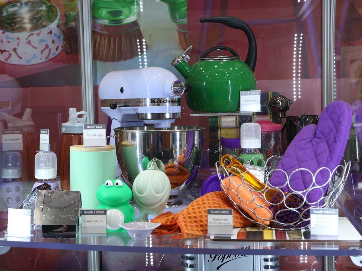
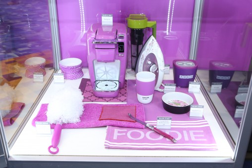
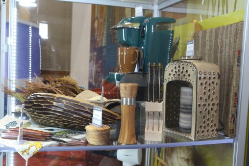
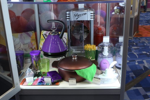
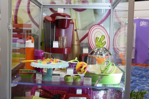
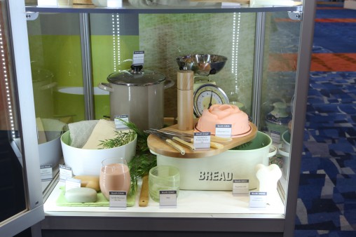
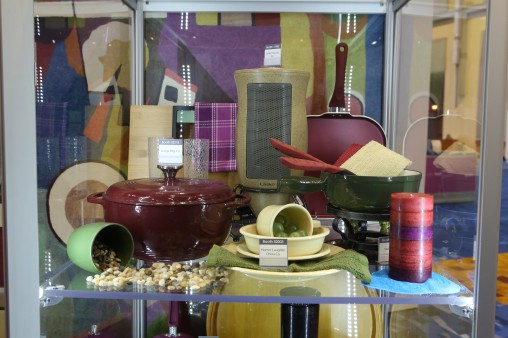
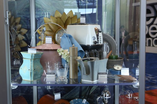
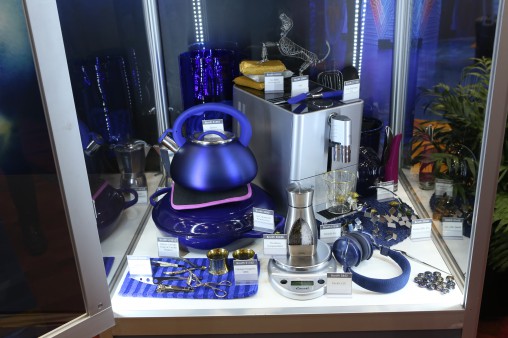
Think pink with a Zoku ice treat maker, an iron and a Keurig coffee machine.Woody, arboreal tones recall a country escape and bucolic authenticity.Notice how the white of the KitchenAid machine still evokes a playful spirit when muddled with vibrant greens and purples?This palette has a darker, late autumn feel to it. Purple can be a very moody, emotional colour.This pastel-heavy palette mixes the very adult maroon coffee machine with the childlike wonder of assorted lollies. Prefer others.This verdant showcase is the embodiment of spring finally breaking through after a harsh winter. New Hampshire brought to life and a lovely collection for colder, rural climes on Australia’s Eastern interior.There is a thoughtful intensity in the depth of these colours, as though each individual pot, pan, plate and candle has a story to tell.The De’Longhi Icona Vintage toaster in DolceVita catches the eye and then sweeps up the other retro-classic 1950s style homewares. The Icona Vintage range was made to be in this showcase!“Blue…is an international favorite and many customers are dedicated to it,” said Pantone’s Lee Eiseman. “But even though it’s been a big seller, you need to ask yourself, ‘What shade of blue and what intensity do you use to get newness out there?'”