Colours have become an increasingly important feature of both small and large appliances over the past 24 months. Whether it is a function of technology becoming homogeneous, meaning appearance becomes an influential differentiator, or consumers becoming more adventurous, bright bold colours are standing out on the benchtop and major appliances are gradually shifting away from black and stainless steel.
In small appliances, Kenwood has been a trailblazer with its phenomenal kMix range. This set of award-winning small appliances came not just in a range of colours but in a range of personalities. The clever marketers at De’Longhi, owner of the brand, mined colourful themes for all their worth — ‘Sun Kissed Yellow’, ‘Bold Blue’ and ‘Mystic Purple’ — with an online quiz to guide customers to their spirit colour and a social media element with thousands of interactions.
Kenwood’s success has been very influential. Since the broad success of the kMix range, we’ve seen Breville organise its colour gamut around several key tones: Cranberry Red, Sesame Black and Elderberry (blue). Cuisinart’s much loved ice cream maker range focuses on subtle pastel colours that recall the iOS 7 scheme, while Russell Hobbs, Morphy Richards and Sunbeam have all dabbled in colours.
Trend watchers in the premium built-in cooking space will be focusing squarely on Miele in the new year to see what impact its bold move into the colour spectrum has on cooking appliances. Change in the majors happens at a glacial pace — it is a much more conservative industry — so the effort Miele is going to in promoting its new three new colours will either be gamechanging or, conversely, a waste of time and money.
During a recent interview with Miele’s co-owning managing director, Dr Markus Miele, we did a call-and-response on the colours chosen for the Generation 6000 range:
Brilliant White — “Great colour: 50 per cent of new kitchens in Germany are white or white-ish.”
Mink (marketed as ‘Havana Brown’ in some markets) — “Good for older kitchens.”
Obsidian Black — “It fits into designer and modern kitchens.”
Stainless steel — “Classic; will account for 70-to-75 per cent of all sales.”
As Dr Miele reveals in that last response, the traditional stainless steel aesthetic will continue to be the most popular for the short-to-medium term. A leading manufacturer such as Miele, however, would not invest so much in new colours if it didn’t there was a growing and viable market for black, white and brown ovens, steamers and microwaves.
We know colours are enormously popular in smalls and a growing force in majors, but what is popular today can seem very unfashionable very quickly. So what colours should suppliers, manufacturers and retailers be focusing on?
The “world-renowned authority on colour” Pantone will be unveiling its 2015 Home + Interiors collections at the House and Homewares Show in Chicago, United States, in March 2014. These nine palettes act as both trend forecasts and taste makers. Simply because Pantone is promoting these colours as upcoming trends, they are likely to become trends, such is the colourful company’s influence.
Appliance Retailer has managed to acquire a preview of these nine palettes — do these collections match your appliance plans for the next 12-to-24 months?
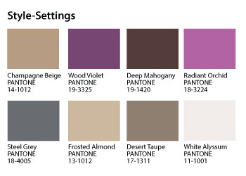
Pantone says this flagship palette is based on existing trends in sartorial elegance and resonates with “poise, finesse and polish”.
AR Favourite: Wood Violet
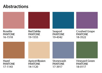
Abstractions brings together “disparate places” to “create an artistic whole”, Pantone says. Imagine a mixed-and-matched set of benchtop smalls in these colours — recalls the tones De’Longhi has used for its Icona Vintage range.
AR Favourite: Stonewash
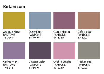
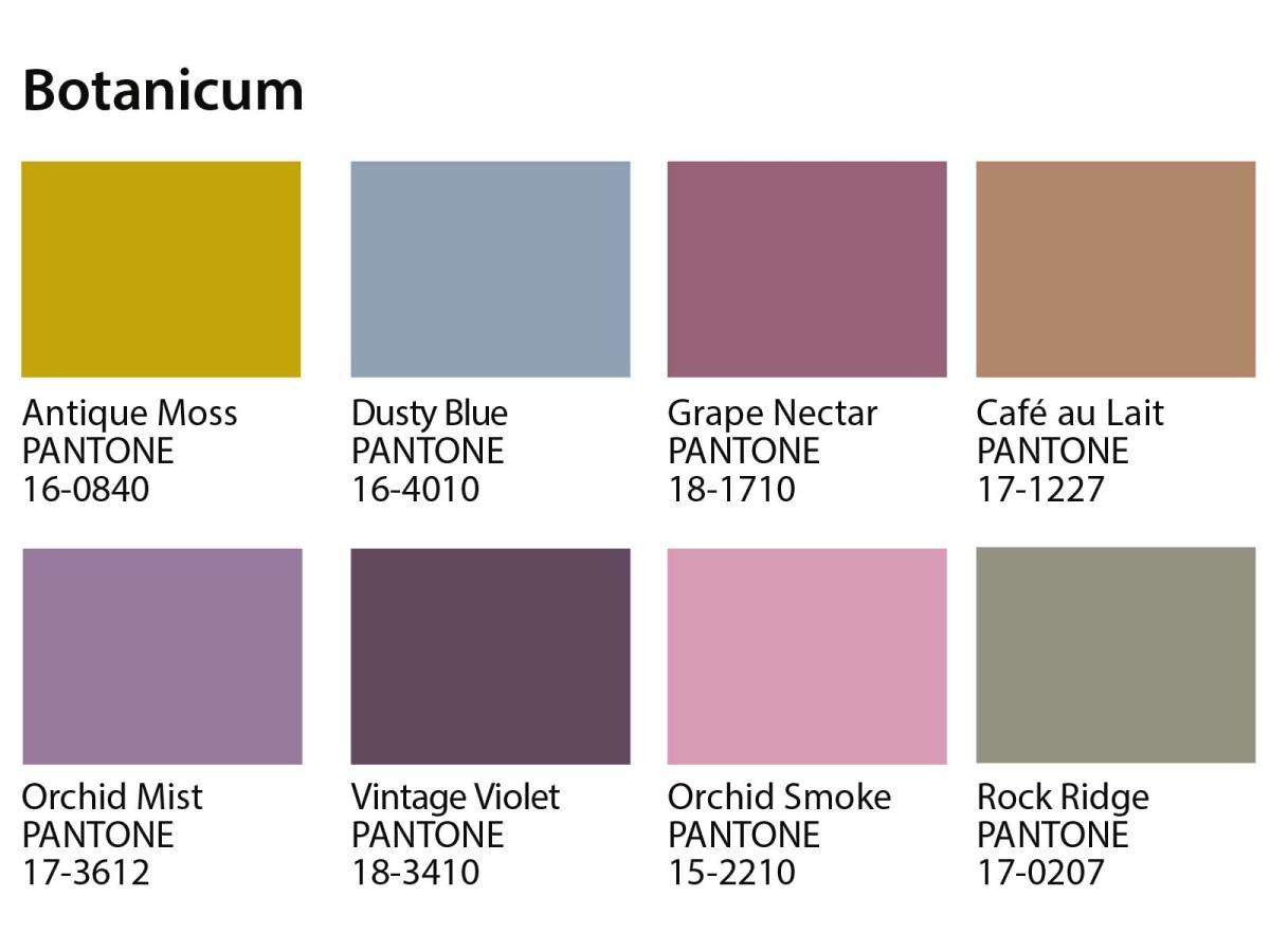
The “complexities of flora and fauna” is the inspiration for Botanicum, which appears more closely aligned with homewares and giftwares than appliances.
AR Favourite: Orchid Mist
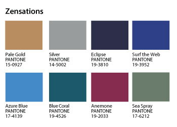
It may be that Silver (quite a bland name for a Pantone colour!) and Eclipse are skewing my regard for Zensations, but I think this is the most apropos palette for ‘medium appliances’, like microwaves and steaming ovens. Surf the Web is such a winning, soothing tone that would look great on a capsule coffee machine while Azure Blue would look great on a handheld vacuum.
AR Favourite: Surf the Web
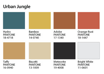
Expect to see the sylvan, bucolic tones of Urban Jungle on show at Eurocucina in Milan in April 2014. Siemens used its IFA press conference to talk extensively about the global urbanisation of the world’s population, which will lead to more escapism within the home, and it would be no surprise for the German company to unveil Adobe or Bright White appliances.
AR Favourite: Orange Rust
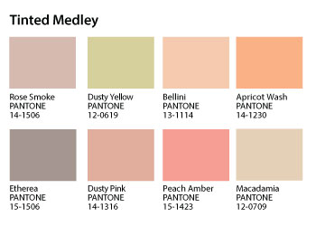
Pantone may say that Tinted Melody is a “harmonious composition of…deliciously warm tones” but I think they are hideous.
AR Least Hated: Rose Smoke
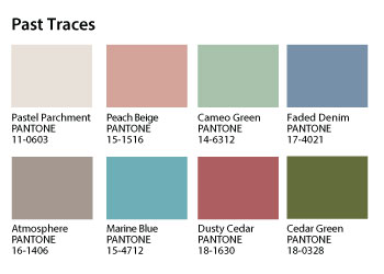
Past Traces is a great name for a palette that includes such maudlin colours as Faded Denim and Dusty Cedar. I can definitely see these colours being used to distinguish consumables, like vacuum cleaner bags, coffee capsules or carbonated drink flavours.
AR Favourite: Cedar Green
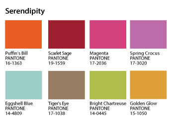
Timing is everything for suppliers looking to make Serendipity work in their ranges. This palette of “unlikely designs and unexpected colors” would look splendid on a breakfast appliance set released in spring for the southern Christmas rush.
AR Favourite: Scarlet Sage
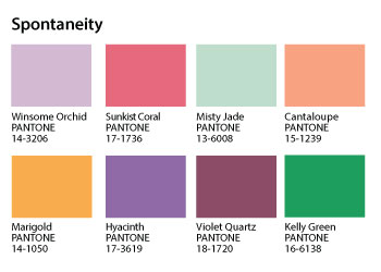
Six of the eight colours in Spontaneity are named for living things, no wonder this is such a vivacious, bright and happy palette. Pantone says it is ideal for “spur of the moment, impulse buying” and I agree; they would look great on those knick-knack appliances (salt and pepper mills, electronic bottle openers and fans) — pile ’em high and watch ’em fly!
AR Favourite: Kelly Green