
Opinion

Dan Ratner is an expert in visual branding, such as logos, fonts and styles, and is currently the managing director of uberbrand (styled in lower case), a consultancy that helps companies create and define positioning and brand strategy. We asked Ratner to cast his careful eyes at five major retailers and run the rule over how their visual branding compares. His report makes for interesting reading.
When it comes to major brands within a category such as appliances and electrical goods, a big part of their visual identity is based on the need to differentiate themselves from each other.
Harvey Norman, The Good Guys, JB Hi-Fi, Betta Home Living and Winning Appliances are all examples of how brands differentiate in a market. Each of these businesses is consumer-facing; some are looking to attract similar customer types, while others are aiming for different types. All of them have applied a visual brand to help communicate their differences.
![]()
The whole Harvey Norman visual brand suggests this company is positioning itself around price. The logo uses cooler and safer blue type, while juxtaposing a red underline, reflective of cutting prices. The brand name itself is based on an individual and uses this to imbue personal attributes to the brand. Together, this combination says ‘we do deals; buy what you need here’.
![]()
The Good Guys brand looks to compete directly with Harvey Norman. Using a simple, strong San serif (without the edges) typeface in all upper case, its looking to grab your attention. The brand name explicitly sends the message that it wants to be a genuine alternative to the other – the ‘good guys’ (as opposed to all other brands, which are, by inference, are ‘bad guys’).
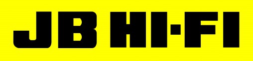
JB Hi-Fi looks to have taken a completely different approach visually from both The Good Guys and Harvey Norman. It applies bright yellow juxtaposed against bold black colouring and a large, block type to capture your attention. This combination looks to turn heads in an instantly identifiable way, which can be important for shopfronts. The JB Hi-Fi visual branding is strong and unique in this highly competitive price-orientated market.
![]()
Betta Home Living’s branding does not differentiate as strongly as the others. It seems it is looking to the competition by mixing The Good Guys, Harvey Norman and JB Hi-Fi, and the result is a weaker and more unclear brand message for consumers. To better position Betta Home Living in context to the competition, a stronger proposition to consumers needs to be developed and translated into the visual identity. To do it requires deeper understanding and tighter selection of its target audience. For example, if we take the brand name literally, is suggests a more lifestyle orientated brand but the use of the altered spelling of ‘Betta’, combined with the blue text and yellow background, connotes a budget-conscious appeal.

Finally, Winning Appliances has specifically positioned itself as a lifestyle brand. Its use of cursive, naturalistic font and muted, neutral colouring, gives it lesser cut through and makes it easier on the eye, delivering an overall impression of luxury. Its visual appearance is more representative of lifestyle than price. Winning Appliances has considered its customer type and developed a visual identity around that. Consequently, it looks to convey a sense of quality and elegance through the selection of typefaces, photographic imagery and key worlds all very different to the traditional competition.
Appliance Retailer welcomes informed thought leadership and expert guest contributions. If you would like to submit or learn more, please contact the editor.